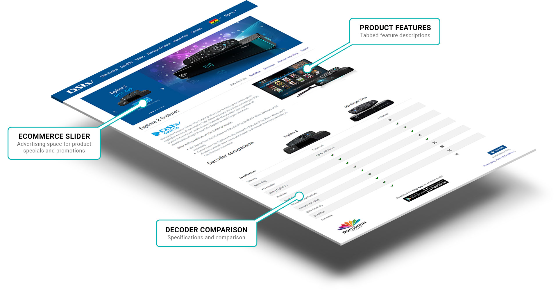
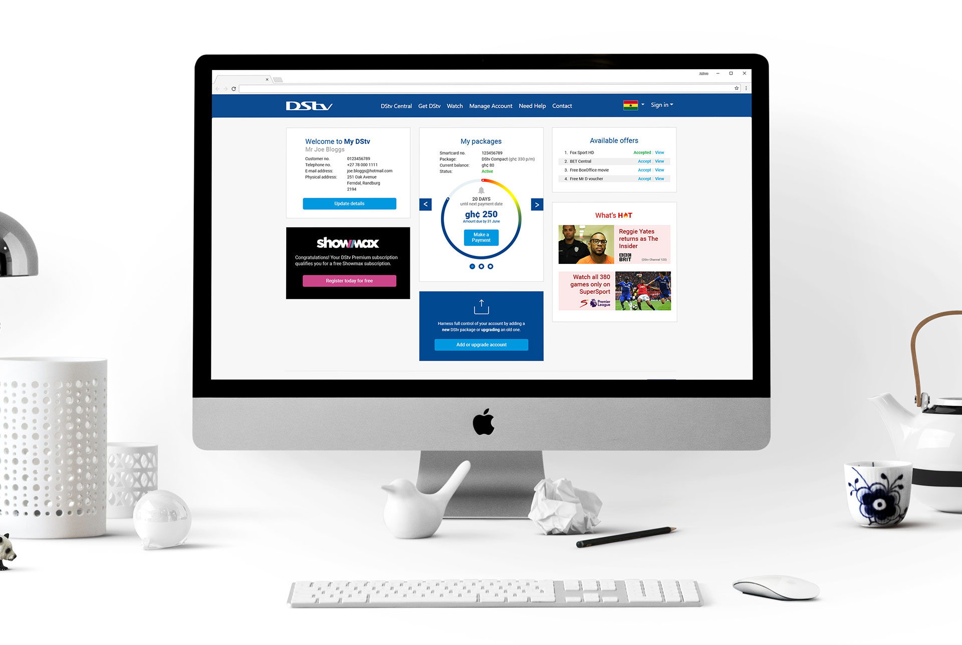
The original Self Service website was failing both users and the organisation alike as it suffered from disjointed information architecture, scattered pages and to make things worse the page load times were worryingly high.
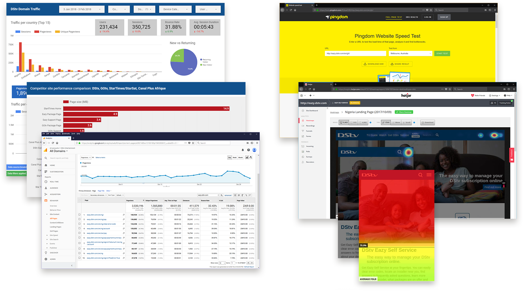
By performing an extensive UX audit (qualitative and quantitative research) on the existing website we were able to study and document various behavioural patterns. This ground work provided a solid foundation for what users really wanted thereby paving the way for user centred design.

Information architecture • Wireframes • UI design • Manage tasks among team members: research gathering (customer habits/trends) & quantitative insights
For an effective, user centred website its the Information Architecture (IA) that makes it or breaks it when it comes to the 'findability factor' (the level of ease a user is able to successfully navigate a website). So to keep things as simple as possible the navigation was broken into 4 main categories: Get DStv, Watch, Manage account & Need help.
To help convey a concept to numerous stakeholders or to test findability issues with real users, wireframes were employed early and often throughout the design process.
All icons were designed in Adobe Illustrator

