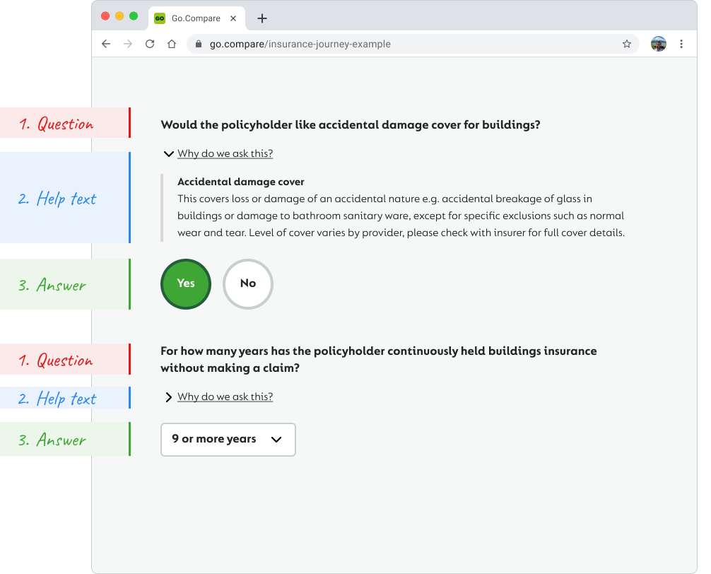
Go.Compare insurance journeys (question sets) generally follow a pattern of: 1. Question 2. Help text 3. Answer choice. By using this pattern structure a design system was built in Figma to: increase the speed of building pixel perfect insurance journeys, maintain a consistent approach and be the 'single source of truth' for designers, product owners/managers and developers to reference and/or follow.
Build all UI elements from scratch • Extend Figma's styles to component patterns with on/off switches • Build interchangeable assets between desktop, tablet & mobile views
The old Go.Compare design system is extensive, but not practical as it hadn't been kept up to date, so its accuracy had lapsed over time. Also it was clunky.
From a clean slate I defined all the individual elements (colours, typography, spacing and imagery) thereby establishing the foundation for a new design system. The next stage was bringing these elements (atoms) together to produce components, then patterns (organisms) and eventually fully defined pages.


Each component is built from the ground up from predefined elements (atoms).
Its real strength is in its ability to pivot. Even though a design system is incredibly structured (rigid) it is also flexible as saved changes ripple through Figma documents thereby remaining a 'single source of truth' across the board.
Fortunately the question set is generally quite predictable (steps 1, 2, 3) making a design system quite easy to implement.
Extending the design system components further with a UI on/off switch capability in Figma really made reusable instances a breeze for designers to use.

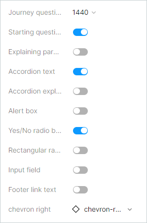
Go.Compare's full UI library has alot of added variations that needed incorporating. Fortunately Figma accommodates nesting components within components which made handling this requirement achievable.