Customers find the Home insurance journey (question set) far too long to complete comfortably (±80 questions in total, longer than any competitor). Besides the long length of the exercise, questions at times are guessed by customers as witnessed in a number of usability tests the research team conducted. This habit can result in inaccurate quotes which in turn leads to problems when making a claim. A serious concern for the business.
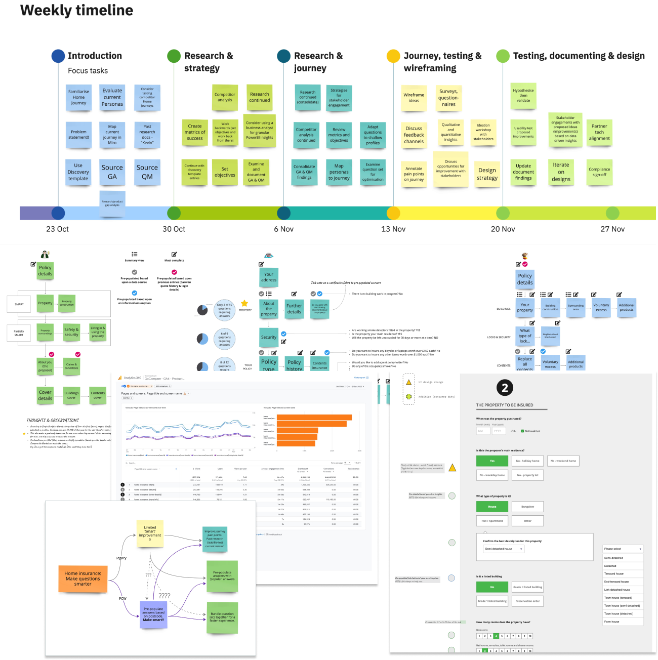
Competitor research • Extensive usability testing of the insurance journey • All findings and recommendations documented • Update the insurance journey's design style to Go.Compare's latest version (myself) • Design a new techniques to speed the answer process up (myself)
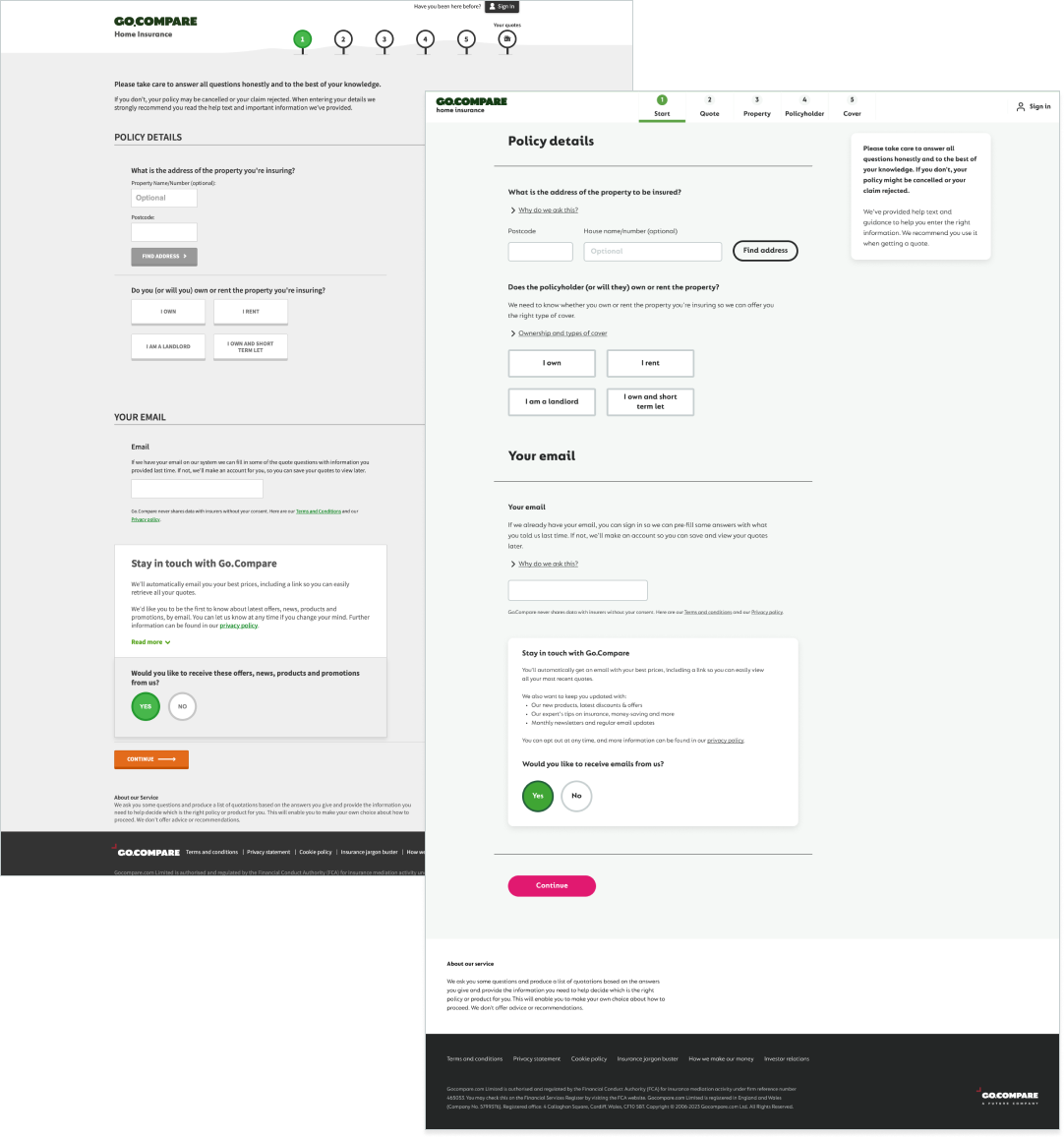
To maintain a consistent approach on all Go.Compare's insurance journeys (question sets), my first task was reskinning the whole journey. By following the in-house design system developers are assured of a pixel perfect design reference that is consistent with other updated insurance journeys on the Go.Compare website.
Problems (pain points) are identified, then tested/validated with users and solved collaboratively with many iterations if necessary. A patient, yet thorough exercise.
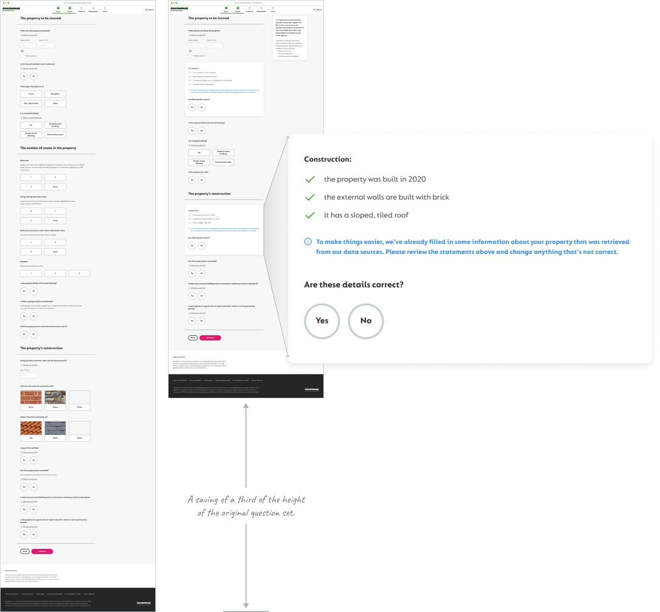
I recreated the entire Home insurance application experience for desktop and mobile in the new design system for developers to accurately reference. Updated all the questions from the 1st to the 3rd person so customers can also quote for friends and family members. I also introduced imagery to help users better identify their roof type, building type and lock. Explored different user journey options and help make recommendations for the next iteration (there were many).
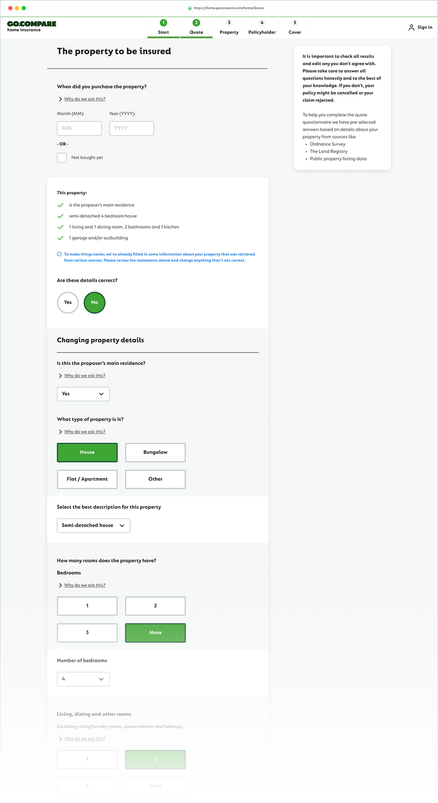
My standout contribution was the introduction of what became known as the 'Summary view'. By using one's postcode, profile details and some well informed assumptions we're able to pre-fill some of the answers to the question set. Within the design system guidelines, I changed parts of the UI design to a summary of editable answers that would shorten the length of the Home insurance application process and also remove some of the guesswork from the exercise. See below for more details.
Even though it remains a compulsory question to answer, with the introduction of the Summary view content is now easier to digest and quicker to review.
Should one of the statements need correcting, then by selecting 'No' expands the Summary view to show all. This expanded view is the original question set so the user's experience isn't disrupted.
This new feature can work seamlessly with other insurance products on the Go.Compare platform and will hopefully be rolled out elsewhere.